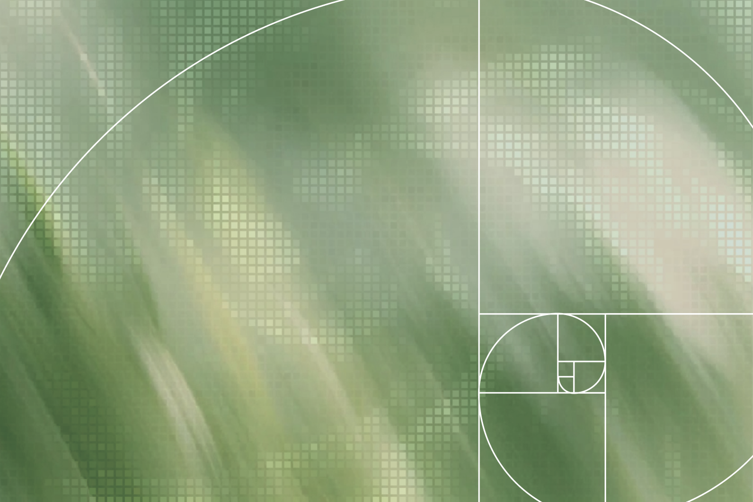
Grid systems are often associated with precision and balance in logo design. They can help designers establish proportions, align relationships, and create consistency between different parts of a mark. But a grid alone cannot make a logo meaningful or distinctive. In this note, we look at how grids can support the logo design process, where they are most useful, and why visual judgment should always come before mathematical perfection.
Grid systems are often associated with precision and balance in logo design. They can help establish proportions, create relationships between forms, and bring consistency to a mark. But a grid alone cannot make a logo distinctive.
For us, a grid is not the starting point of every logo. More often, it becomes a tool for refining an idea once the concept begins to take shape.
A logo can be mathematically perfect and still be forgettable. A strong idea should always come before the system used to construct it.
Mathematical alignment and visual alignment are not always the same thing.
A circle and a square can share exactly the same dimensions while appearing different in size. A symbol can be perfectly centered according to its coordinates and still feel slightly off to the eye.
This is why we often adjust forms beyond the grid.
The grid gives us structure. The eye gives us balance.
In logo design, optical correction is not breaking the system — it is often what makes the system work.
A grid should guide the design, not control it.
Where grids become especially useful is in creating relationships between elements.
Stroke widths, corner radii, negative spaces, angles, and repeating shapes can all share a common logic. These small relationships are rarely noticed individually, but together they create a sense of consistency.
The same logic can later extend beyond the logo itself.
A proportion used in the mark might influence layouts. A geometric element might become part of a pattern or icon system. An angle might become a recurring part of the visual language.
This is where logo construction begins to connect with the wider brand system.
[Burada ikinci görsel / brand application]
Not every logo needs to be built from circles and perfect geometric modules.
Some marks are typographic. Some are organic. Some begin as rough sketches and keep part of that irregularity because it gives them character.
Forcing every idea into the same construction method can remove exactly what made the idea interesting in the first place.
The method should follow the concept — not the other way around.
The best grid systems are often the ones you never notice.
People do not need to see the construction lines behind a logo. They only need to feel that the proportions work, that the forms belong together, and that the mark feels balanced.
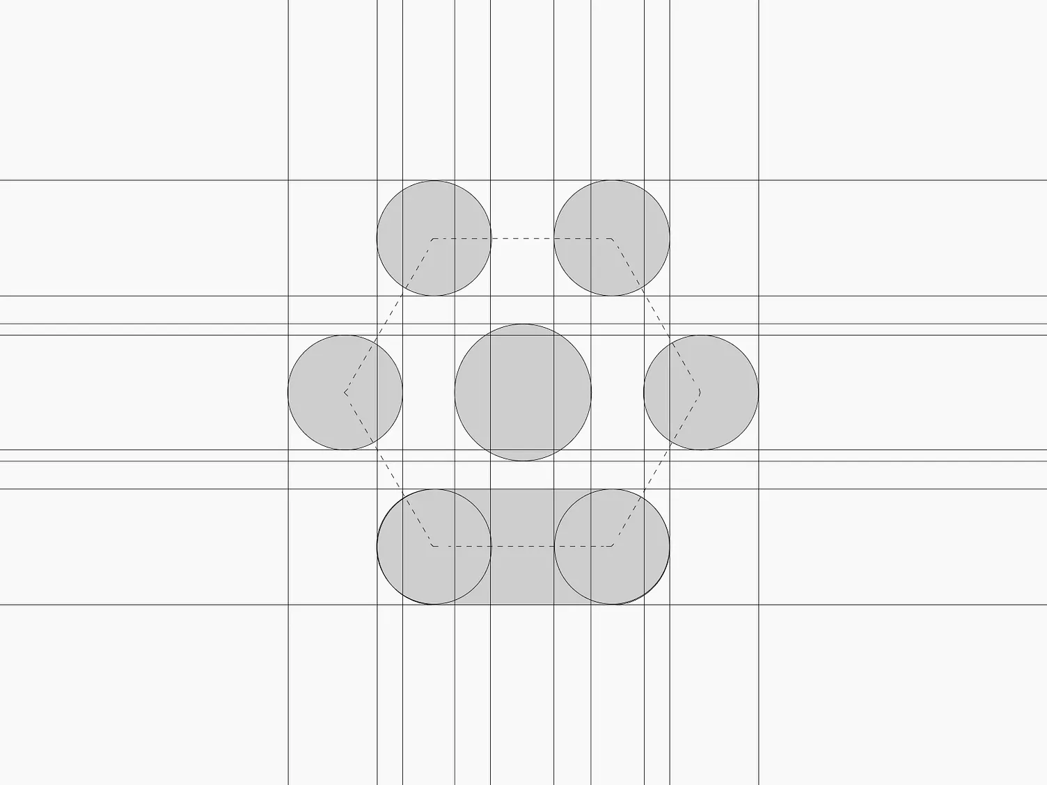
A construction diagram can explain how a logo was built, but it should never be necessary to prove that the logo is good.
For us, the grid remains what it should be:
a tool for creating clarity, consistency, and balance — never the idea itself.
More Thoughts & Ideas
Three distinct logo concepts, refined into one final mark. A focused starting point for your brand identity.
Scope note: Includes logo design and essential usage files. Does not include a full visual identity system or comprehensive brand guidelines.
Two distinct visual directions developed by Elif and Burak for your approved logo. Compare the approaches and choose one to develop further.
Scope note: Conceptual direction only. Previews are not production-ready templates or finished applications. Detailed usage rules and editable system files are part of Brand System & Guidelines.
Turn the selected Brand Sprint direction into a consistent and usable design system, documented in Figma and a practical brand guide.
Scope note: Includes the agreed brand applications and system documentation. Full website production, unlimited applications and ongoing campaigns are outside this project scope.
Ongoing design support for agencies, studios and in-house teams. We create brand applications, digital assets and campaign materials within an agreed monthly scope.
Scope note: Work volume, delivery dates and revisions are agreed before each engagement. This service is independent of the three project-based branding stages.