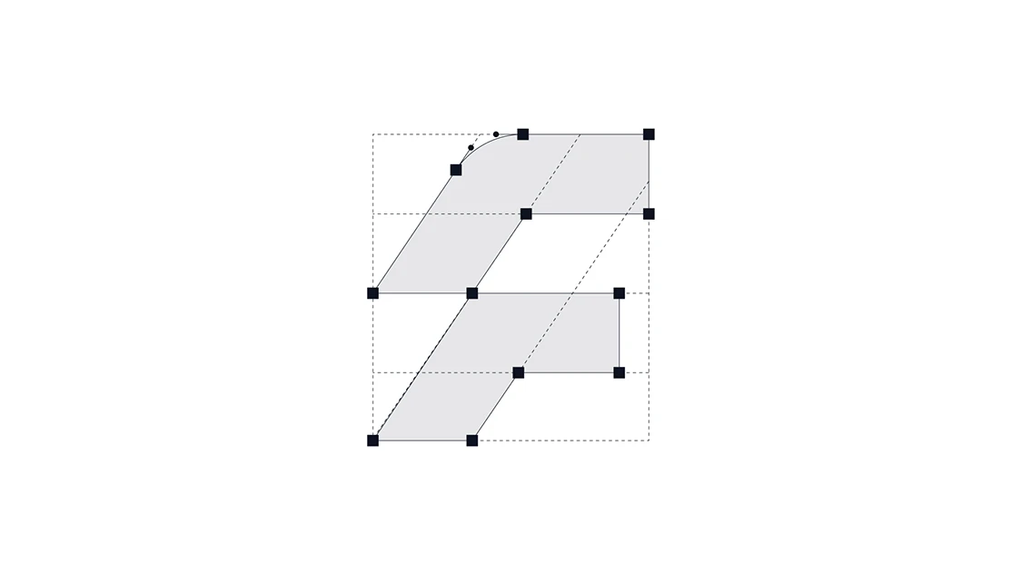
The golden ratio is often treated as a secret formula for creating perfect logos. In reality, it is simply one of many tools that can help improve balance, proportion and construction. A strong idea should always come first.
The golden ratio is important in logo design, but the idea behind the logo is always more important.
A strong concept can exist without the golden ratio. But when you already have a good idea, using proportion and construction carefully can take the design one step further.
The golden ratio should be seen as a tool — not a formula for creating a perfect logo.
A logo does not become good simply because its geometry follows the golden ratio.
Concept, visual balance, drawing quality and proportion come first. The golden ratio can then help refine these elements and create a more consistent construction.
Many experienced designers create excellent logos without calculating every shape mathematically. Years of visual experience often allow designers to understand when something simply looks balanced.
That visual judgment is extremely important.
The golden ratio is approximately 1.618.
In logo construction, this can be used to create a relationship between different shapes and sizes.
For example, if I create a small circle and a larger circle based on the golden ratio, I can reuse those same proportions throughout the rest of the logo.
Instead of introducing completely random shapes, I try to build the design from forms that belong to the same proportional system.
This creates consistency without making the construction unnecessarily complicated.
The golden ratio is much easier to apply to simple and minimal logos.
When a logo contains only a few shapes, controlling the relationship between those shapes is relatively straightforward.
As the design becomes more detailed, things become much more complicated.
When I first started designing logos, I was almost obsessed with applying the golden ratio. I even used it extensively in detailed and illustrative logo designs.
It worked, but it also took a huge amount of time.
Over time I realized that mathematical perfection does not always create visual perfection.
This is probably the most important part.
Even if something is mathematically correct, it may still look visually wrong.
That is why optical corrections are necessary.
Sometimes you need to move a shape slightly, adjust a curve or intentionally break the mathematical system to make the final logo feel balanced.
You can see this approach in many major brand identities. Geometry creates the foundation, but small optical adjustments make the final form work for the human eye.
Nature works in a similar way. We can find proportional systems and patterns everywhere, but they are rarely perfectly mechanical.
Logo design should not be either.
For me, the process is quite simple:
Idea → Visual Judgment → Drawing → Construction → Proportion → Optical Correction
I start with the idea and the visual form.
Once the logo already works, I use construction systems and proportional relationships to check whether anything can be improved.
The golden ratio comes near the end of the process, not at the beginning.
It helps refine a logo. It does not create the idea.
That distinction is important.
Trust your eye first. Use mathematics to support it.
In another article, I’ll go deeper into how the golden ratio can actually be used in logo construction through circles, repeated shapes and proportional systems.
More Thoughts & Ideas
Three distinct logo concepts, refined into one final mark. A focused starting point for your brand identity.
Scope note: Includes logo design and essential usage files. Does not include a full visual identity system or comprehensive brand guidelines.
Two distinct visual directions developed by Elif and Burak for your approved logo. Compare the approaches and choose one to develop further.
Scope note: Conceptual direction only. Previews are not production-ready templates or finished applications. Detailed usage rules and editable system files are part of Brand System & Guidelines.
Turn the selected Brand Sprint direction into a consistent and usable design system, documented in Figma and a practical brand guide.
Scope note: Includes the agreed brand applications and system documentation. Full website production, unlimited applications and ongoing campaigns are outside this project scope.
Ongoing design support for agencies, studios and in-house teams. We create brand applications, digital assets and campaign materials within an agreed monthly scope.
Scope note: Work volume, delivery dates and revisions are agreed before each engagement. This service is independent of the three project-based branding stages.